
I redesigned the Blue Bottle app to address its weaknesses and added features like a digital wallet for improved user experience.
I redesigned the Blue Bottle app to address its weaknesses and added features like a digital wallet for improved user experience.
About
Blue Bottle Coffee has continued to grow over the last few years. However, their contrary to their interior design and perfected cup of cappuccinos, their mobile app is lagging behind.
So I took this opportunity and redesigned the Blue Bottle Mobile App as a personal project.
Project
Role / Product Designer
Tools / Figma
UX Research
UX Design
Customers Need More than Coffee.
Customers Need More than Coffee.
Well... Sometimes
Well... Sometimes
The Blue Bottle app, while aligned with the brand’s minimal aesthetic, lacks differentiation and personalization, limiting user engagement and loyalty.
The Blue Bottle app, while aligned with the brand’s minimal aesthetic, lacks differentiation and personalization, limiting user engagement and loyalty.
It means a lot for you to be here!
I put a lot of work into this portfolio, and it would mean a great deal if you could head over to a larger screen to view the rest of this case study!
Planing Out a Timeline
Every project differs in how I strategize. But drawing out my project timeline and understanding priorities is important in both individual or team projects.


User Research
“I order the same thing almost every day, but there's no way to save my favorite items or see my most ordered drinks. Such a basic feature missing!"

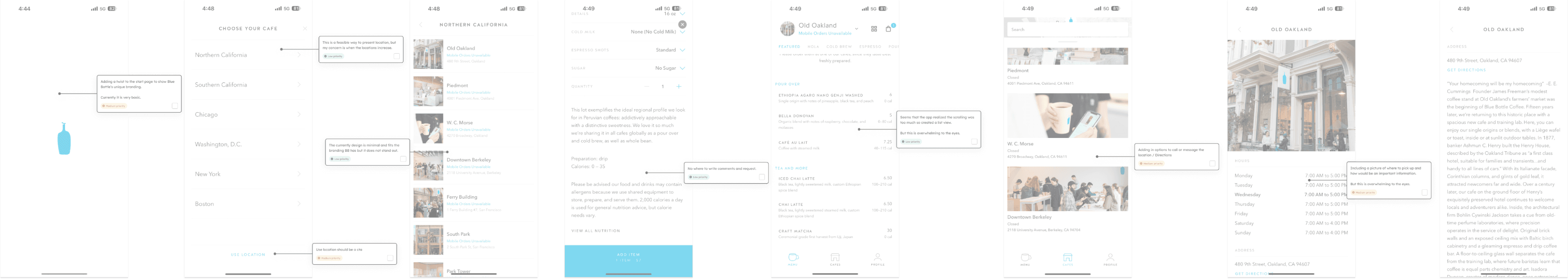
Heuristic Evaluation
Experiencing the App as a User
The Blue Bottle app reflects the brand's minimalist style but fails to stand out from competitors or offer much personalization, which could hinder customer retention. While it works well for ordering ahead, it lacks appeal for broader audiences, making it less enticing to download.


How might we make the app more compelling to download and encourage regular use?
This is a question I would continue to return to.
As Is / To Be
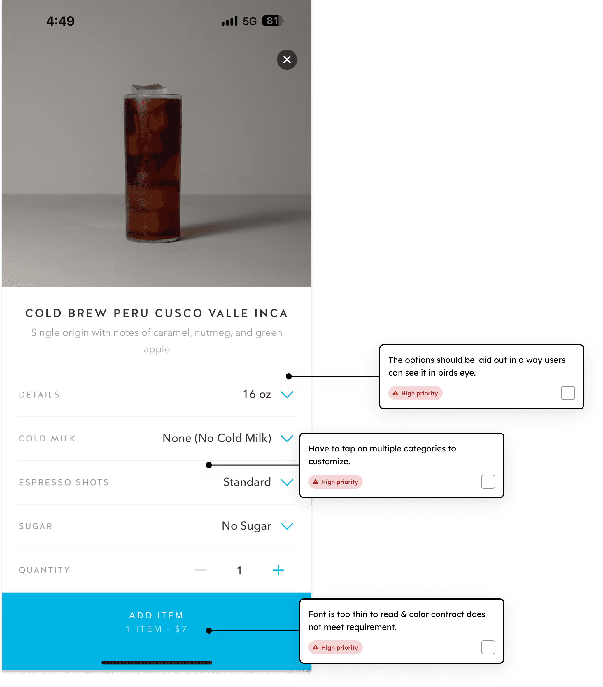
Limitations to Customization
The current app for Blue Bottle has many limitation from being able to and fill it up with more information here.

Confident Users
Allow users to be seen and known
Reward system that encourage user
Notify the users
Readable Menu
Customization in order
Scan Card - Purchase gift card/ reload
Clear location services.
Target State
Current state
Challenging User Experience
Limited Login Options
Inaccurate Location Services
Lack of Special Instructions Field
Limited Store Selection in App
Limited Ordering Customization
No presence of live activity
User Flow
User Flow
“I order the same thing almost every day, but there's no way to save my favorite items or see my most ordered drinks. Such a basic feature missing!"
I looked through the mobile app store reviews to learn about the pain points of users. Organized them through card sorting.

Style Guide
The Display of the Core Branding
Blue Bottle is known for its woody, minimalistic interior design and it reflected that on web and mobile. However, to match a similar vibe of the web design currently live, I brought in darker elements.
Typography
Aa
Chronicle Text
Heading
Aa
Halis GR
Text
Color
#333333
#000000
#0995CE
#FDFBF7
#FFFFFF
BLUE BOTTLE COFFEE
The Final Design
Blue Bottle is known for its woody, minimalistic interior design and it reflected that on web and mobile. However, to match a similar vibe of the web design currently live, I brought in darker elements.

Home Page
According to mobile UX studies, users make decisions about an app's value within the first 8 seconds of landing on the homepage, and apps with personalized homepages see a 32% higher conversion rate and 45% increase in average session duration, as users can quickly access their most relevant features and content.
New Feature
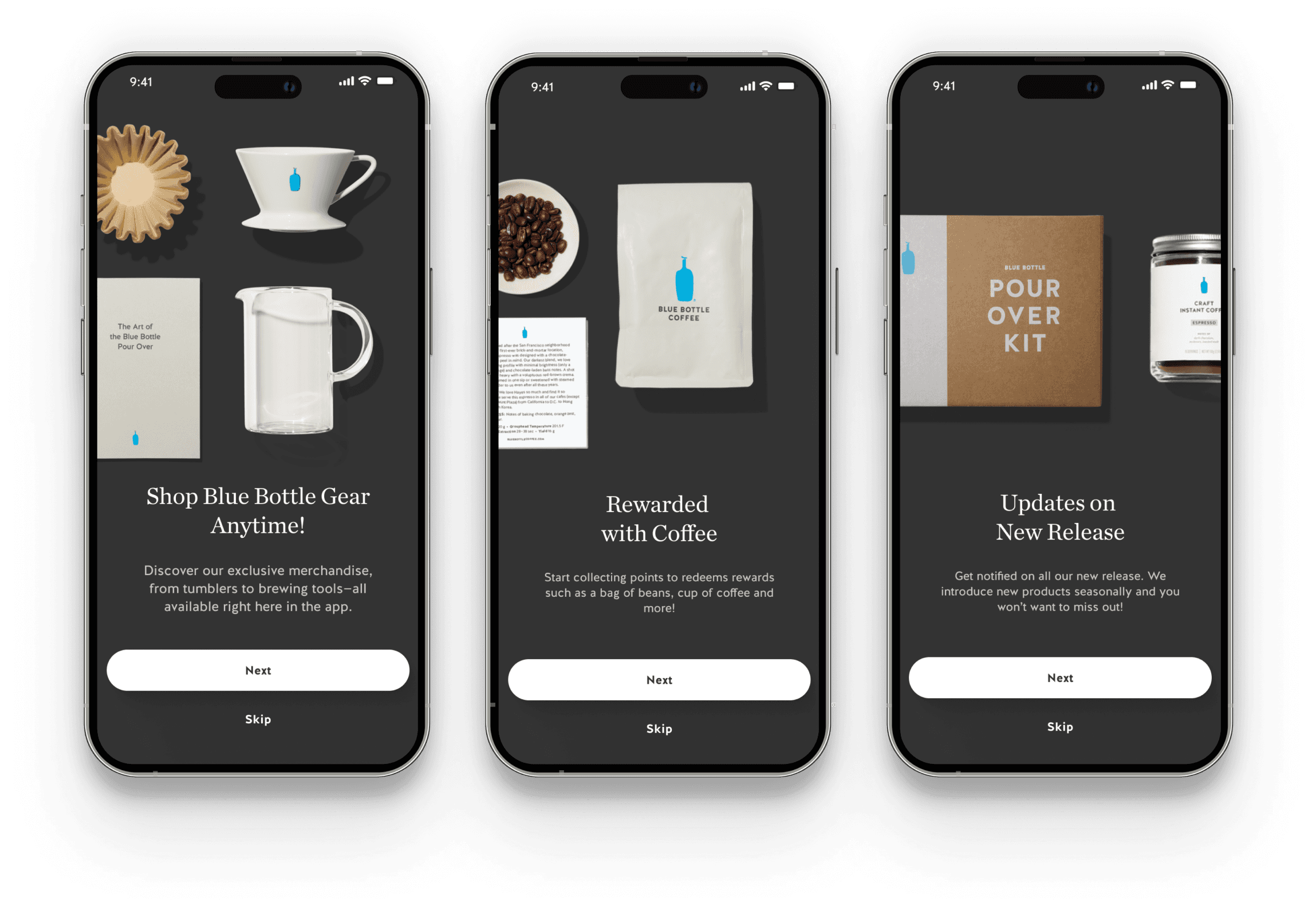
Onbording
Research shows that effective app onboarding increases user retention by 50% within the first month and makes users 72% more likely to remain active after three months, while apps without onboarding see a 78% abandonment rate.
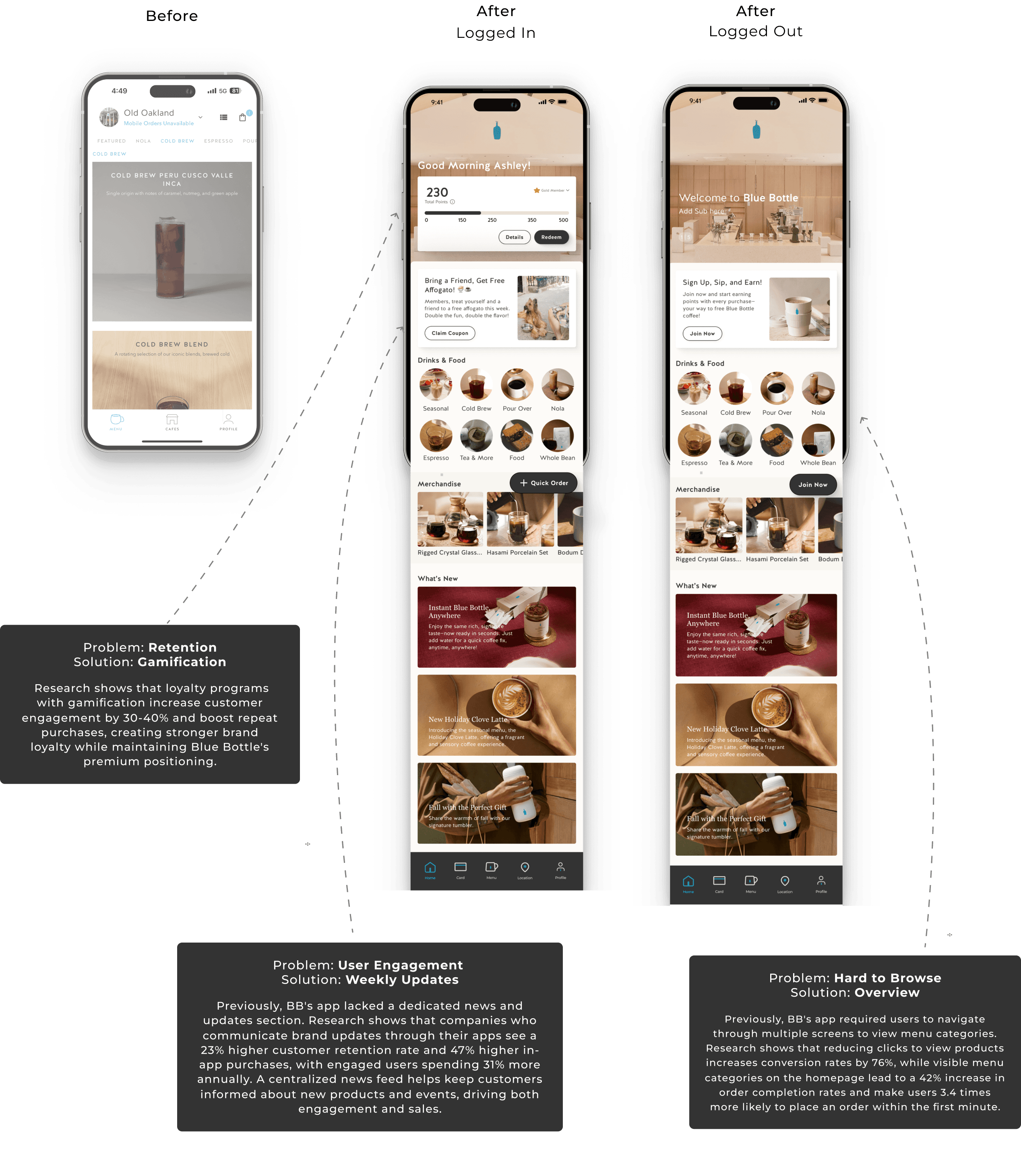
Home Page
According to mobile UX studies, users make decisions about an app's value within the first 8 seconds of landing on the homepage, and apps with personalized homepages see a 32% higher conversion rate and 45% increase in average session duration, as users can quickly access their most relevant features and content.
New Feature
Onbording
Research shows that effective app onboarding increases user retention by 50% within the first month and makes users 72% more likely to remain active after three months, while apps without onboarding see a 78% abandonment rate.
Menu
The menu redesign tackled the ordering experience through improved navigation and clearer information hierarchy. By restructuring categories and simplifying the layout, customers can now find their desired items more efficiently, reflecting Blue Bottle's commitment to quality and simplicity.
Menu
The menu redesign tackled the ordering experience through improved navigation and clearer information hierarchy. By restructuring categories and simplifying the layout, customers can now find their desired items more efficiently, reflecting Blue Bottle's commitment to quality and simplicity.

Order
In today's competitive coffee market, convenience is key. The redesigned app makes ordering effortless, ensuring customers can get their Blue Bottle coffee with minimal friction.

New Feature
Quick Order
Research shows that 53% of mobile users abandon apps that take over 3 seconds to navigate. The new floating button enables instant ordering and sign-up, keeping users engaged in an industry where convenience drives loyalty.

New Feature
Card Scan
The new digital wallet feature enables faster checkout through pre-loaded funds, while helping customers track spending and earn rewards. This simple addition transforms each purchase into a seamless, rewarding experience

Navigation
Key features are now directly visible in the navigation bar instead of being hidden in a hamburger menu, making frequent actions immediately accessible. Research shows this improves feature discovery by up to 21% and matches how customers actually use coffee apps.

Location
The redesigned store location page solves a major user frustration by combining store finding, contact options, and reviews in one accessible place. This makes stores more discoverable and accountable for service quality.

The Blue Bottle app redesign, focusing on user ease, converts the traditional coffee routine into a seamless activity that caters to the requirements of our speed-driven, digital-centric consumer base.
HANNA D. CHANG
Product Designer,
currently working in Los Angeles

Think I’d be a good fit for your team or project?
Let’s connect!
SELECTED PROJECTS
SOCIALS
HANNA D. CHANG
Product Designer,
currently working in Los Angeles
Think I’d be a good fit for your team or project?
Let’s connect!
SELECTED PROJECTS
SOCIALS
HANNA D. CHANG
Product Designer,
currently working in Los Angeles
Think I’d be a good fit for your team or project?
Let’s connect!
SELECTED PROJECTS
SOCIALS
Think I’d be a good fit for your team or project?
Let’s connect!
SELECTED PROJECTS
SOCIALS
HANNA D. CHANG
Product Designer,
currently working in Los Angeles